Sneakers For Sports and Other Schemes

The Original Design:

img_6076

This is the Converse All Star! I couldn’t find out who exactly designed this. I do however know that it was released in 1974 as part of a new advertisement campaign after the brand was purchased by Elta Corporation. It was in the February Hot Rod Magazine of that year. During this time, the number one basketball shoe was the All Star and everyone wore them. Pictured was a suede-leather shoe. This definitely targeted the athletic community and with a name like Converse, they could afford it.

  • Design (Contrast, repetition, alignment, proximity)

design.jpg

Regarding the design, it is clear that this is in line with many of the retro styles of the day. We have the gradient showing the dark blue to light  here. The contrast between the blue and the white is clear even as it gets lighter. However, there is more subtle contrast used near the bottom as the gradient fades to white. Due to all of the elements being relatively large, most of the elements are in pretty close proximity. The alignment is all centered and sure, it gives the ad a slightly more casual appearance, but we are all really looking at the shoes.

  • Color

color.jpg

When it comes to color, there are 3 main colors involved. We have the white, black, and blue. As mentioned above, there is a gradient employed which gives the ad that refreshing, retro look. The white and black of the text serve as contrast to the differing shades of blue. The color is likely all based around the image of the sneakers there in the center of the design.

  • Typography

text.jpg

Within the typography, there isn’t anything too terribly flashy to report. The caption shown is clearly a serif font according to all of the slanted serifs therein. However, the text blurb below is clearly in a virtually weightless sans serif font. This is attractive to use, due to the size and the amount of text. The centering keeps the viewer’s attention inward, as was likely the intention.

My own iteration:

img_6077

  • Design (Contrast, repetition, alignment, proximity)

design1.png

Within my design, it clearly shows a similar feeling with the alignment. I attempted to imitate the centricity of the original design. Because of the size and placement of the central image, the text doesn’t follow the exact pattern shown in the original. There is no gradient, but the background used still aided in employing some contrast to the design.

  • Color

color1.png

Because the only converse sneakers I had available were orange, the color was changed to an orange. The white, black, and orange of the shoes all are imitated in the rest of the design. Both of the text areas still aid in contrast against the stark orange backdrop.

  • Typography

text1.png

Within this iteration, a serif font is once again used for the main caption. A serif font is as well used in the main text blurb below. The text is still not too flashy as to draw the viewer’s attention to the shoe instead.

The original and new ad both have a number of very similar features. They both follow the same rules of typography, color themes and layout. Although the messages in the text of either ad differ slightly, the new design was offered as kind of a follow up, a response to the original. The overall effect though, is the same. The image of the shoe and the text showing the brand name are the central, highlighted features of both designs and they clearly show a call to action, which obviously is the purchase of this (in this student’s humble opinion) fantastic pair of kicks.

Rebellion, and Other Family Matters

IMG_5832.JPG

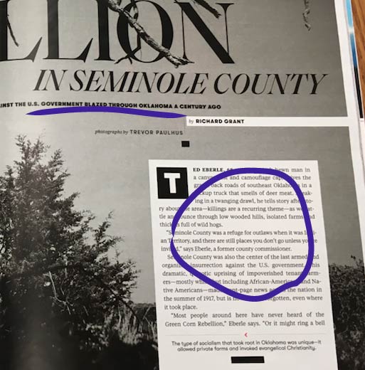
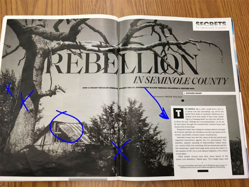
What we see here is an photograph of Seminole County Oklahoma taken by Trevor Paulhus. This image appears in the October 2019 Smithsonian Magazine located online here. It kind of stuck out to in particular not just due to the stark nature of the black and white but, because I have a lot of family in Oklahoma, just about a 2 hour drive East from where this picture was taken.

Identify the category of the typefaces used, and explain how they are identified,

4shot.jpg

Within the title, it’s Modern typeface. We can tell this by the radical thick to thin transitions in the stress. There is also no bracketing therein. The subtitle, author and photographer name are all within sans serif face. There is no thick and thin transitions anywhere and no serifs. Lastly, the text is in oldstyle face. There are serifs slanted on the lowercase letters with bracketing. There are also moderate thick to thin stroke transitions.

What elements make the two typefaces contrasting?

1shot

Between the typefaces, there are many elements used to contrast. The first one is the obvious size difference. The title is fairly large, while the subtitle, names, and text are much smaller. Secondly, the title, subtitle, and names are of a much heavier weight while the text is quite light. Third, the structure of the subtitle and names are monoweight while the title is very not. Fourth, when it comes to the form, the text is mostly lowercase, as it is when we write, but the rest of the type is in all caps. Lastly, one can see that the title, subtitle and names all have a horizontal direction while the text possesses a vertical direction, thanks to the text box used in formatting. There are also some italics in the small type in the title.

How the photographer utilized the Rule of Thirds, Leading Lines, or Depth of Field.

Untitled-2

Although the house is located there on one of the bracket vertices, the most used photography trick in this picture is depth of field. The bush is front and center, followed by the tree, followed by another tree and the house on a similar line. Behind the text box (as viewed in the original image), there is yet again another field, this one being quite literal and three poles of some sort.

Take three photos with your own camera:

IMG_1136.JPGIMG_23383shot

The original photograph was mimicked by use of the depth of field trick. The first photograph here, taken near the Dalles, Oregon clearly has a difference between the street, the trees, and the mountains in the background. The second was taken on the Willamette River in Oakridge, Oregon which also employs the depth of field. This is through the water, the vegetation on the bank and the trees. The last picture, taken in Rexburg Idaho employs the depth of field as well, between the field and the road. They would still work in the layout, due to the fact that (if taken in black and white) would give off a very similar vibe to the original photograph. Despite the fact that none of these photographs were taken in Oklahoma, the look is still the same, kind of the sense of barrenness that comes to mind when thinking about the Great American Frontier.

The above principles contributed to the overall design because the type faces that were used showed a real sense of professionalism. Certainly, the title has a striking, ‘dazzling’ look as the modern face requires and the text is attractive, yet simple in the oldstyle. Furthermore, not only do the striking black and white contrast with the image, but the depth of field gives it, obviously some depth. These principles together indeed give off that polished, professional look.

How Do Safe Drivers Look!?!

Stop the Violence, Drive SafeThis is an ad from The Advertising Agency: Terremoto Propaganda, Curitiba, Brazil created for Ecovia, a mass transit company in Brazil.

From the picture, we can see a man getting punched in the jaw by another man, however a red car is painted across the man’s cheek and a green truck appears on the other man’s fist. It’s an ad advocating not to drink and drive. It’s a clever approach, because it’s a slightly startling image, and the use of color against the dark backdrop is stark and effective in capturing attention.

From here, we can see a variety of things.

Proximity

For starters, all of the important elements are in close proximity. The fist and the face and their corresponding symbols that represent vehicles. The ad’s message is also right there in the thick of it. The company name isn’t too close to the rest of the elements as well, as we can see, because it’s supposedly the biggest takeaway.

Alignment

Furthermore, when it comes to alignment, the two text spaces are distant from each other, but they still are along the same horizontal line. The main text is also right smack dab in the middle of the action as well.

Repetition

Then, we can see elements of repetition in color. Much of the text is in white, but some of the text is in red which corresponds to the color of the car on the man’s face. Within the company’s symbol, there is some green which corresponds to the truck on the fist.

Contrast

So, when it comes to contrast, most of the color is concentrated in the center of the image. As can be clearly seen, the backdrop is very dark and even the man’s hair and clothes are dark colors which add on the contrast between the black and the color.

Color

Now, back to color. The ad uses minimal color, depending more on the drama of the lighting against the black for effect. Colors it does use though, are reds, warm colors designed to pop and greens which are cooler colors meant to contrast against the hotter colors.