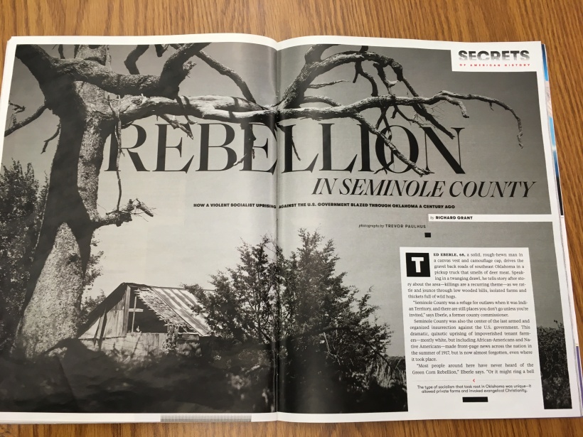
What we see here is an photograph of Seminole County Oklahoma taken by Trevor Paulhus. This image appears in the October 2019 Smithsonian Magazine located online here. It kind of stuck out to in particular not just due to the stark nature of the black and white but, because I have a lot of family in Oklahoma, just about a 2 hour drive East from where this picture was taken.
Identify the category of the typefaces used, and explain how they are identified,
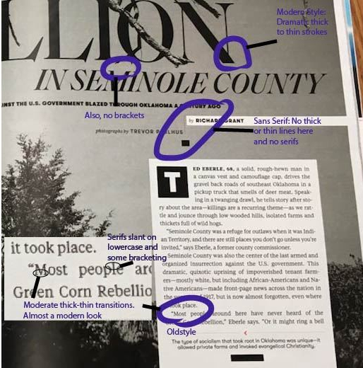
Within the title, it’s Modern typeface. We can tell this by the radical thick to thin transitions in the stress. There is also no bracketing therein. The subtitle, author and photographer name are all within sans serif face. There is no thick and thin transitions anywhere and no serifs. Lastly, the text is in oldstyle face. There are serifs slanted on the lowercase letters with bracketing. There are also moderate thick to thin stroke transitions.
What elements make the two typefaces contrasting?
Between the typefaces, there are many elements used to contrast. The first one is the obvious size difference. The title is fairly large, while the subtitle, names, and text are much smaller. Secondly, the title, subtitle, and names are of a much heavier weight while the text is quite light. Third, the structure of the subtitle and names are monoweight while the title is very not. Fourth, when it comes to the form, the text is mostly lowercase, as it is when we write, but the rest of the type is in all caps. Lastly, one can see that the title, subtitle and names all have a horizontal direction while the text possesses a vertical direction, thanks to the text box used in formatting. There are also some italics in the small type in the title.
How the photographer utilized the Rule of Thirds, Leading Lines, or Depth of Field.

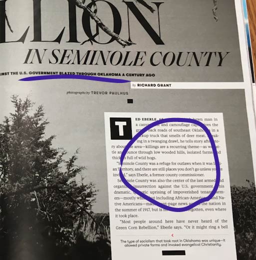
Although the house is located there on one of the bracket vertices, the most used photography trick in this picture is depth of field. The bush is front and center, followed by the tree, followed by another tree and the house on a similar line. Behind the text box (as viewed in the original image), there is yet again another field, this one being quite literal and three poles of some sort.
Take three photos with your own camera:


The original photograph was mimicked by use of the depth of field trick. The first photograph here, taken near the Dalles, Oregon clearly has a difference between the street, the trees, and the mountains in the background. The second was taken on the Willamette River in Oakridge, Oregon which also employs the depth of field. This is through the water, the vegetation on the bank and the trees. The last picture, taken in Rexburg Idaho employs the depth of field as well, between the field and the road. They would still work in the layout, due to the fact that (if taken in black and white) would give off a very similar vibe to the original photograph. Despite the fact that none of these photographs were taken in Oklahoma, the look is still the same, kind of the sense of barrenness that comes to mind when thinking about the Great American Frontier.
The above principles contributed to the overall design because the type faces that were used showed a real sense of professionalism. Certainly, the title has a striking, ‘dazzling’ look as the modern face requires and the text is attractive, yet simple in the oldstyle. Furthermore, not only do the striking black and white contrast with the image, but the depth of field gives it, obviously some depth. These principles together indeed give off that polished, professional look.
